cover-img

Make your website responsive in 3 easy steps

6 July, 2022

9

9

0

We are going to follow 3 main steps:

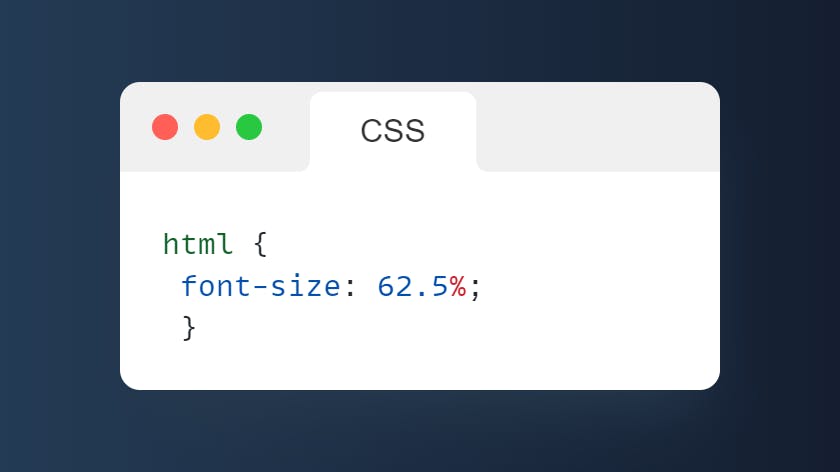
1. html { font-size: 62.5% }

2.

Use "rem" instead of "px"

3.

Update media query
Step 1
• Set the font size of html to 62.5%
img
Step 2
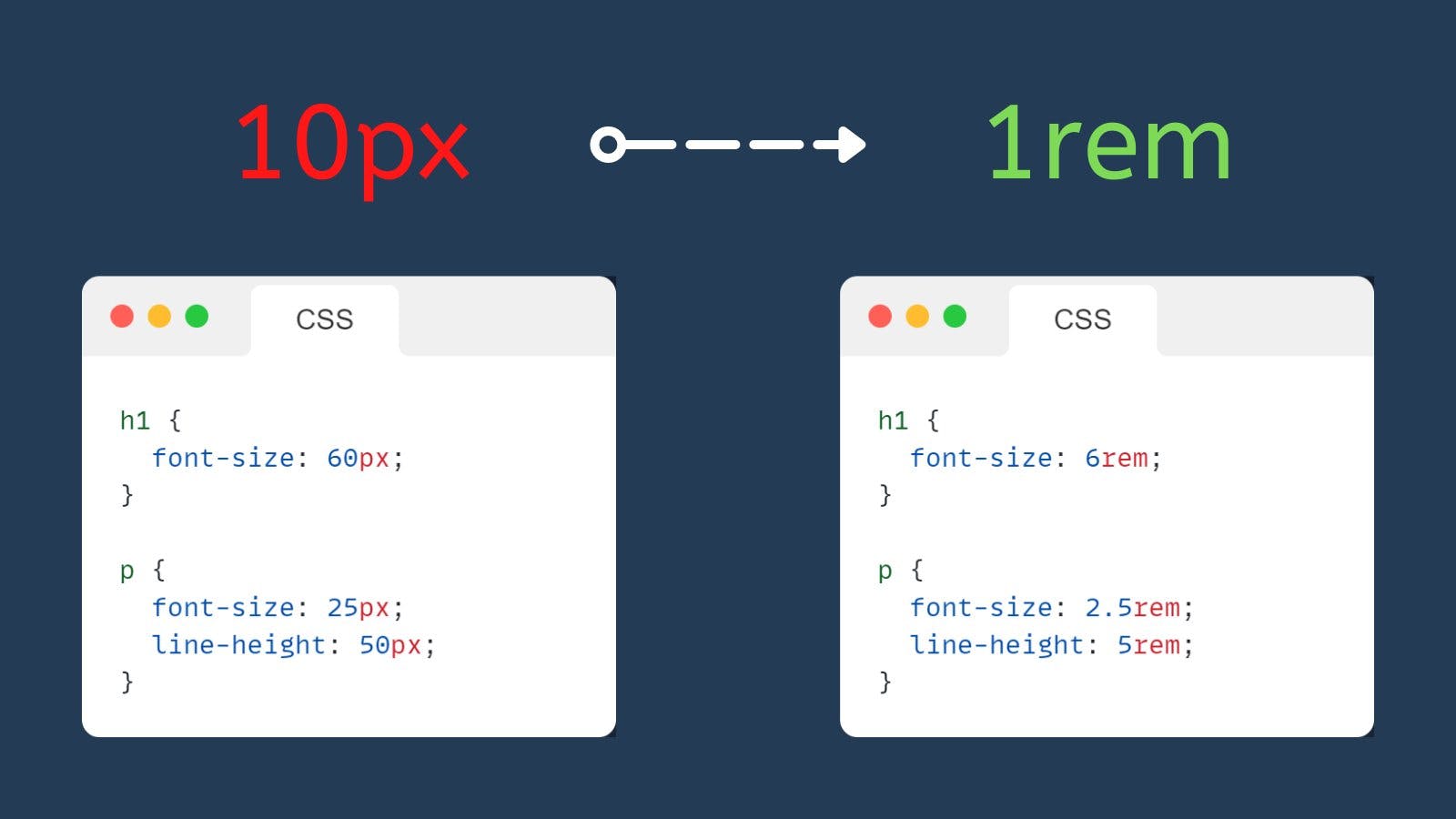
• Use "rem" instead of "px" unit
• rem is relative to the font size of the root element (Html)
• As default When the font size of root element is 100% = 1rem = 16px
• Since the font size of the root element (html) is 62.5% = 1rem = 10px
Note - To use rem as a unit, we have to divide the px unit with 10 60px / 10 = 6rem 25px / 10 = 2.5rem
img
Step 3
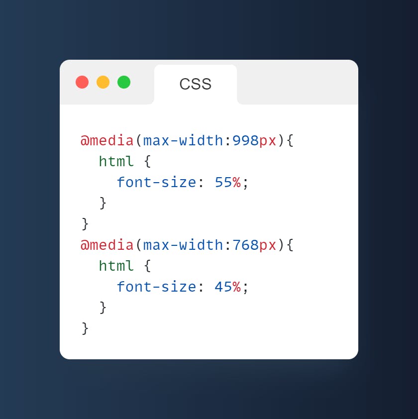
• Updating Media query
• Now in 998px devices, font-size: 55% = 8.8px
• And in 768px devices, font-size: 45% = 7.2px
img
• By following these steps you can create a very responsive website.
• You can also change the display property in the media query as per your need.
That's all for now.
Thank you so much for getting to the end of the article 💙 !
If you liked this article, make sure to:
Follow me @imAlfaiz
Like, Comment & Share it with your friends.

Do Follow me on Twitter to get Daily Tips and Useful Threads on Web-Development.

css

html

javascript

web development

responsive design

9

9

0

css

html

javascript

web development

responsive design

Alfaiz ⚡
Hii 👋 • Front-end Enthusiast 🎨 • Sharing threads related to web dev on Twitter

More Articles

Showwcase is a professional tech network with over 0 users from over 150 countries. We assist tech professionals in showcasing their unique skills through dedicated profiles and connect them with top global companies for career opportunities.

© Copyright 2024. Showcase Creators Inc. All rights reserved.