
Data Analysis & Visualization Using Python — Beginners Guide!
8 September, 2020
3
3
0
Contributors

The goal of this blog post is to give you valuable information that can help you get started with data analysis.
These are some questions we are going to go over in this post:
- What is Data Analysis?
- Why should you Use Python?
- Why visualize data?
For data analysis and visualization, I use Jupyter NoteBook. You can use any platform that you are comfortable with, as long as the code is the same. If you want to try on Jupyter Notebook, the link for downloading Jupyter Notebook will be below
Jupyter NoteBook Download Link: https://www.anaconda.com/products/individual (Download Anaconda to get access to Jupyter Notebook)
1.1 Data Analysis on COVID-19 (USA)
I will be using real-time data from Kaggle (an open source dataset platform) for a better understanding of Data analysis. If you wish to use this dataset, you can download it from the link:
https://www.kaggle.com/sudalairajkumar/covid19-in-usa?select=us_counties_covid19_daily.csv
So, what is Data Analysis?
In simple terms — to extract useful information from the data.
To analyze data, there are a few steps to follow:
- Data inspection
- Data cleaning
- Data visualization
- Data transformation (Not Covered)
- Data modeling (Not Covered)
We will be covering data inspection, data cleaning and data visualization in this post. The first step in data analysis is to import libraries. Libraries in python are like fuel in a car, without libraries, you can work with basic functions but not data analysis. The same goes for the car without fuel, you can turn on the AC, lights and play music but you cannot make it run.
#Importing librariesimport pandas as pd import numpy as npimport matplotlib as mpl import matplotlib.pyplot as plt%matplotlib inline
Why Python?
Well, Python is not only a good choice but it’s one of the best as it is a good general-purpose language, it’s easy to use and learn and it has many libraries for data science including matplotlib. There are many companies working on data science that are using python so it will be easier for your future job search.
Let’s get started
Let’s create a data frame to store the uploaded data.
So, we have named the data frame as “covid” and we will be using the data frame variable to call out the data in it.
#Creating a Dataframe (covid) data used from kaggle:covid = pd.read_csv('/Users/vaardanchennupati/Documents/Kaggle/COVID-19/covid_us.csv')
1.2 Going Through the Structure of the Data Frame (COVID -19)
We will be looking at the information, statistics, and the column names in the dataset. Overall, this gives us a better understanding of the dataset.
# Lets print the names of the columns present in the datasetcovid.columns
We have 6 columns:
#output
# Column name in the datasetIndex(['date', 'county', 'state', 'fips', 'cases', 'deaths'], dtype='object')
Let’s get the size of the dataset we are working on:
#Now lets check the size of the Datasetcovid.size#output392419
So from the above code, we have information that the dataset consists of 2354514 rows and 6 columns. We got the idea of the data-set outline, but we can simplify this code [dataset_name.shape] , where it gives us the rows and columns present in the dataset:
#Lets get the shape of the DataFramecovid.shape#output
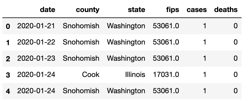
(392419, 6)# Checking the Columns present in the dataframecovid.head()

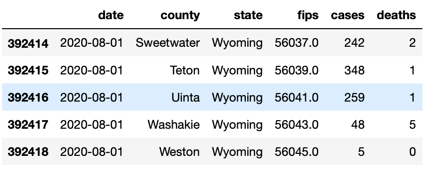
covid.tail()
# Structure of the DataFramecovid.info()#output<class 'pandas.core.frame.DataFrame'>
RangeIndex: 392419 entries, 0 to 392418
Data columns (total 6 columns):
 #   Column  Non-Null Count   Dtype
---  ------  --------------   -----
 0   date    392419 non-null  object
 1   county  392419 non-null  object
 2   state   392419 non-null  object
 3   fips    388484 non-null  float64
 4   cases   392419 non-null  int64
 5   deaths  392419 non-null  int64
dtypes: float64(1), int64(2), object(3)
memory usage: 18.0+ MB
From the above code [dataset_name.info()], we can get information about the column names, null values and the type of data. It gives us the information about the dataset without needing to go through different code for different information.
# For a better understanding of Type of the columnscovid.dtypes#output
date       object
county     object
state      object
fips      float64
cases       int64
deaths      int64
dtype: object
From the above information, we can see that the columns “cases” and “deaths” are only numerical columns present in the dataset, which can be used for visualization or modeling.
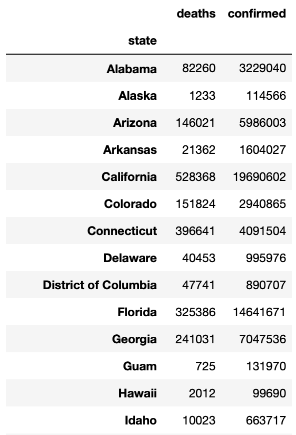
# Now lets look into some Statistics of the dataset | *This only works on columns with integers (Numerical values)covid.describe()

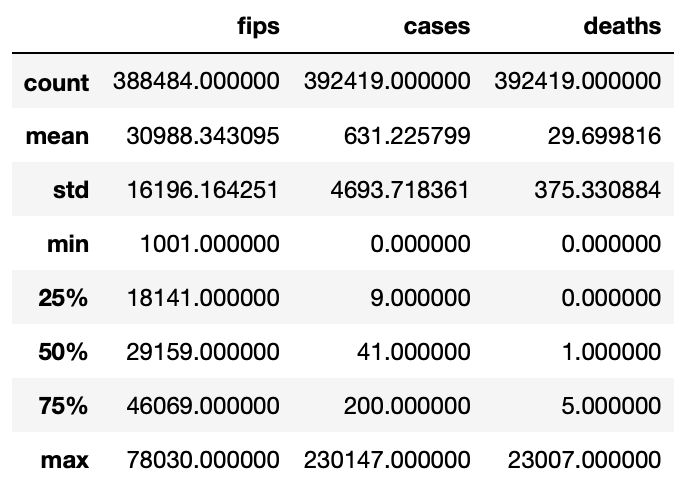
Once again these statistics are only on the columns “cases” and “deaths” in the COVID dataset as they are integers (int64). By the above statistics, we can determine that the county had maximum COVID cases of 230147 and minimum of 0; coming to the maximum deaths of 23007 and a minimum of 0. Whereas the average (mean) COVID cases of all the county out in the USA are 631 and average deaths in the USA is 29.69.
There are only 2 columns that consist of integer in the dataset. So let’s add one more column called confirmed cases we do this by subtracting deaths from no of cases in each state.which results in people with confirmed cases, but there is a catch, we won’t be able to remove recovered cases.
# let check the confirmed casescovid['confirmed']= covid['cases']-covid['deaths']#outputdate
2020-01-21      1
2020-01-22      1
2020-01-23      1
2020-01-24      1
2020-01-24      1
             ...
2020-08-01    240
2020-08-01    347
2020-08-01    258
2020-08-01     43
2020-08-01      5
Name: confirmed, Length: 392419, dtype: int64
1.3 Data Cleaning
We just entered the first stage of data analysis
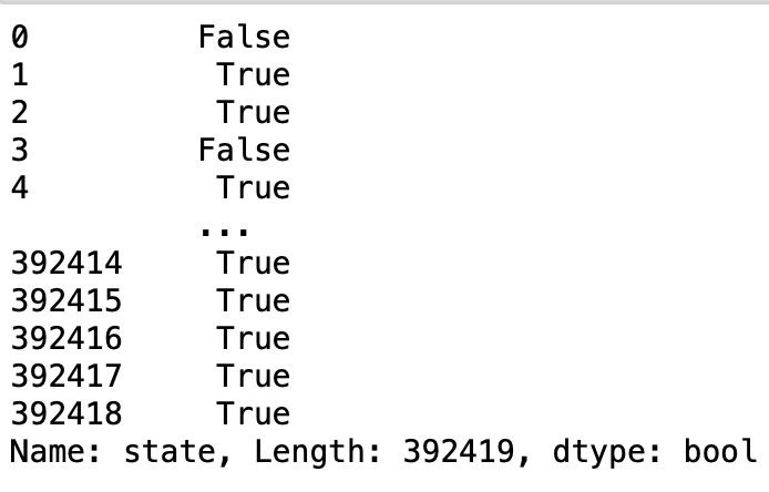
Let’s check if there are any null values in the dataset,
covid.isnull()
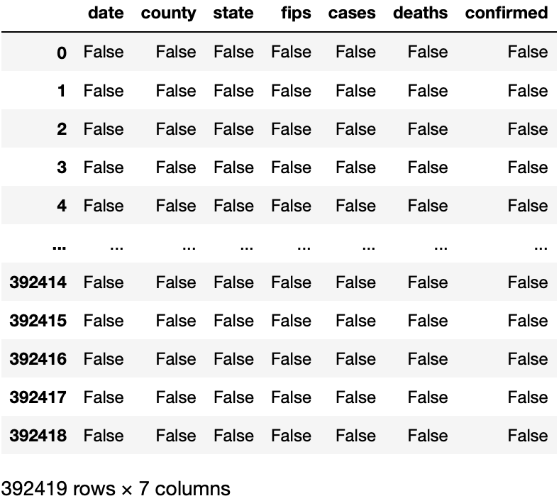
We can observe from Fig(d) that “False” represents that there is no null value, If we had null value in the dataset then it would have been “True” instead of “False”. From the COVID dataset, there are no null values present in it, so, we don’t need to worry about cleaning the data or any transformation or any outliers.
From the dataset, we can analyze that we will be only be utilizing two columns for this analysis. Removing FIPS columns will not effect the data analysis process.
# We can remove Fips Column as it just a speacial number for countyscovid.drop(["fips"], axis = 1,inplace = True)
For visualizing number of deaths and confirmed cases along with the data, we need to convert column [date] into date-time format for the machine to understand. So, we use the code below to convert any column with date in it to the format using pandas library.
#As from the above Data Type we can see that Date is not recognized as timestamp so we are going to convert it into time stampcovid['date'] = pd.to_datetime(covid['date'])
So, we can cross check if the date column is changed to date-time format by checking the type of data in the column.
#checking the type of cloumn
covid.dtypes#outputdate         datetime64[ns]
county               object
state                object
cases                 int64
deaths                int64
confirmed             int64
dtype: object
The column “State” has states that are repeating, To check this, we use a duplicate function which helps us identify repeating variables in a particular column.
#Checking for duplicate in column "states"
covid['state'].duplicated()
As we can observe from the Fig(e), there are duplicate value in the column “State” which is shown by boolean value “True”. To fix this duplicate value, we use the groupby function.
#Fixing the duplicate value
usa =covid.groupby(by=["state"]).sum()
usa.drop(["cases"], axis = 1,inplace = True)
usa
So, we have created a different data frame called “usa” . The duplicates in the column states are merged using the groupby function.

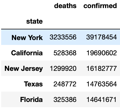
We have set up the data frame with states that have Covid. Let's find out the Top 5 states with highest confirmed cases and deaths.
# Top 5 Confirmed Cases in Usa
max_confirmed_cases = usa.sort_values(by='confirmed',ascending=False)

top_confirmed_cases=max_confirmed_cases[0:5]
top_confirmed_cases
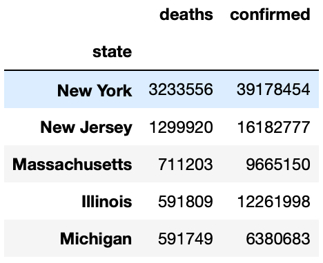
Top 5 states with Deaths:
# Top 5 Confirmed Cases in Usa
max_confirmed_cases = usa.sort_values(by='confirmed',ascending=False)

top_confirmed_cases=max_confirmed_cases[0:5]
top_confirmed_cases
1.4 Data visualization
Why Data Visualization?
It’s very easy for people to understand data when they see it visually. A well thought out visualization just makes the light bulb go off in someone’s head and you just don't get that with a table of numbers or a spread sheet.
Here are some examples for visualization using matplotlib library on the Covid data set.
#creating a dataframe
df2 = covid.groupby(["state"])[['state', 'confirmed']].sum().reset_index()plt.figure(figsize=(10,20), dpi =300)
# titleplt.title('Confirmed Cases is Each State')# x and y labelsplt.xlabel('Number of confirmed cases')plt.ylabel('States')#statement to plot the dataplt.plot(df2['confirmed']/10,df2['state'],color='G', marker = 'o', markersize = 10, markeredgecolor ='black')
# shows the plot
plt.show()# To the save the graphplt.savefig('confirmed_case.png',dpi = 300)# dpi is the pixel density in the graph

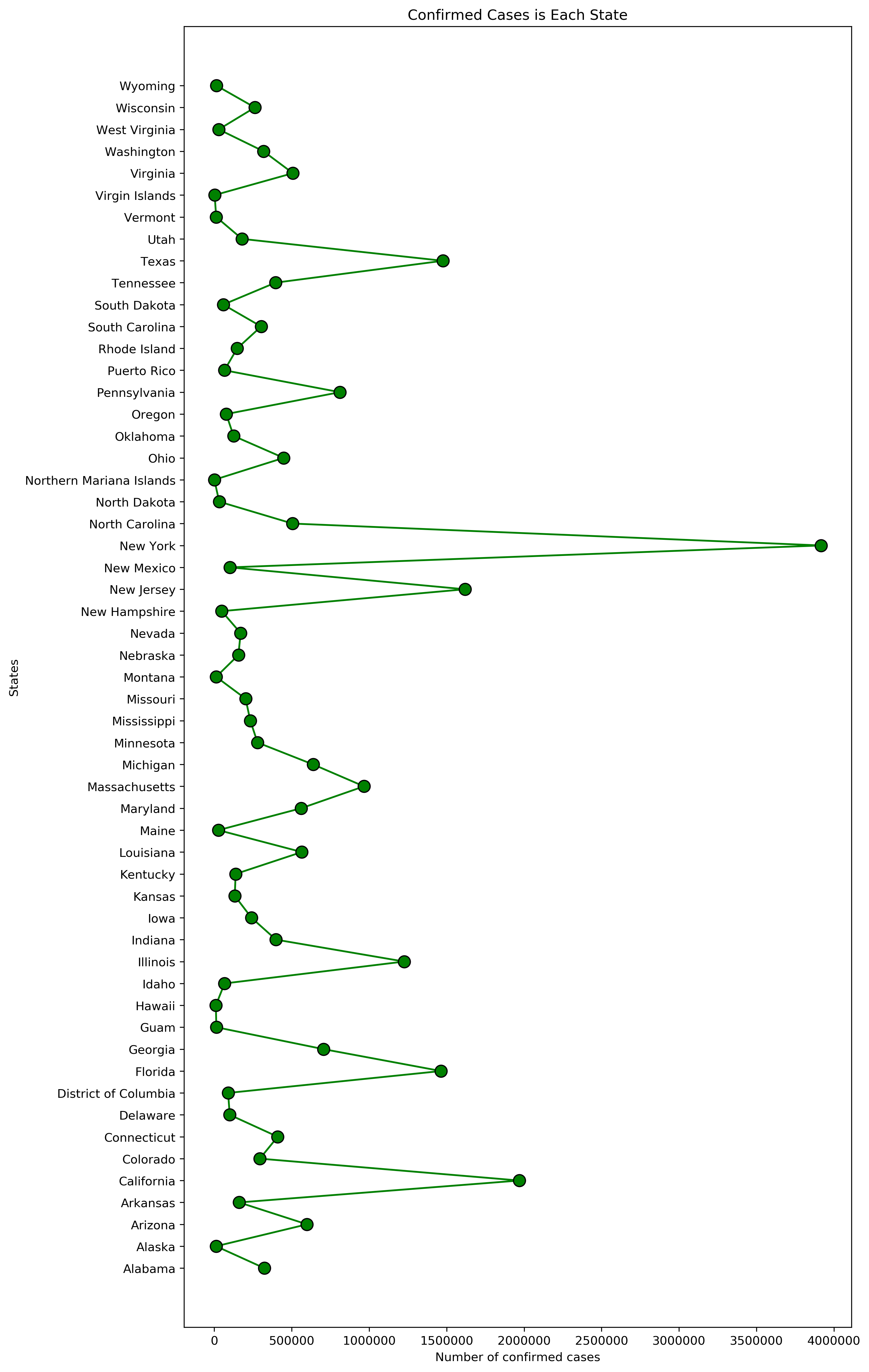
From the above Fig(i), we can analyze that the highest state with Covid cases is New York, but looking at the visualization it doesn't depict much other than the states with highest confirmed cases.
# set the width and hight of the graph
plt.figure(figsize=(20,5),dpi=300)# plotting two graphs in one plt.plot(covid.index,covid['cases'],color='g')plt.plot(covid.index,covid['deaths'],color ='r')# title of the graphplt.title('Comparison of cases and deaths')# X and Y labelplt.xlabel('Date')plt.ylabel('No of Cases')# Labelingplt.legend(['cases','deaths'])

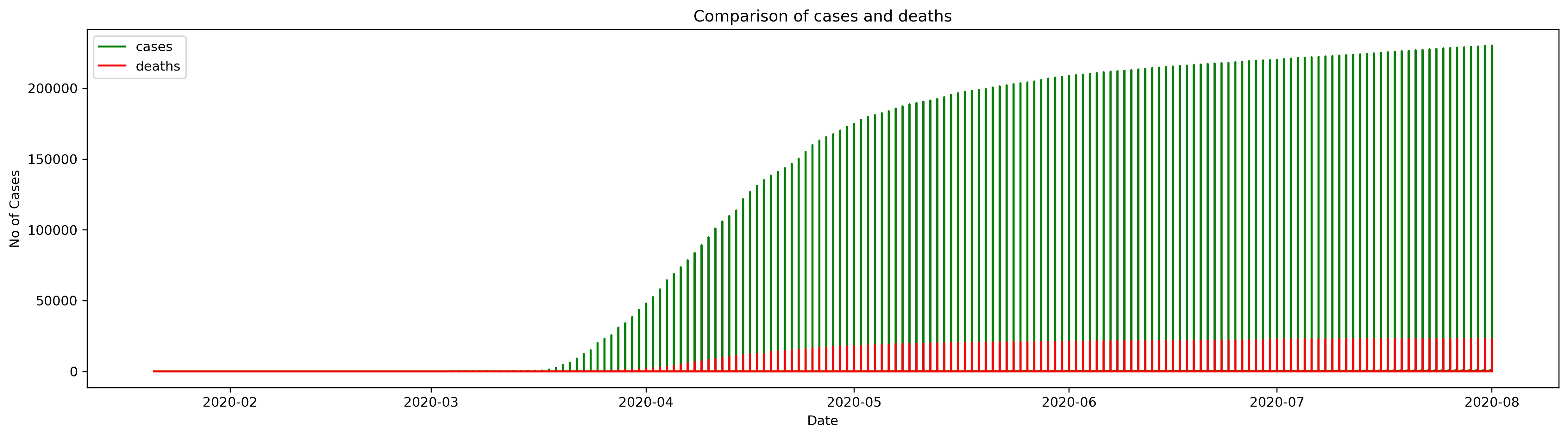
The above Fig(j) graph shows that the cases were going up day by day.
f = plt.figure(figsize=(10,5),dpi=300)f.add_subplot(111)# TO plot axes on the graphplt.axes(axisbelow=True)# Plotting the graphplt.barh(usa.groupby(["state"]).sum().sort_values('confirmed')["confirmed"].index[-10:],usa.groupby(["state"]).sum().sort_values('confirmed')["confirmed"].values[-10:],color="Green")# The appearance of ticks, tick labels, and gridlinesplt.tick_params(size=5,labelsize = 13)# x labelplt.xlabel("Confirmed Cases",fontsize=18)# Title of the graphplt.title("Top 10 States: USA (Confirmed Cases)",fontsize=20)# Grid layout for the plotplt.grid(alpha=0.3)

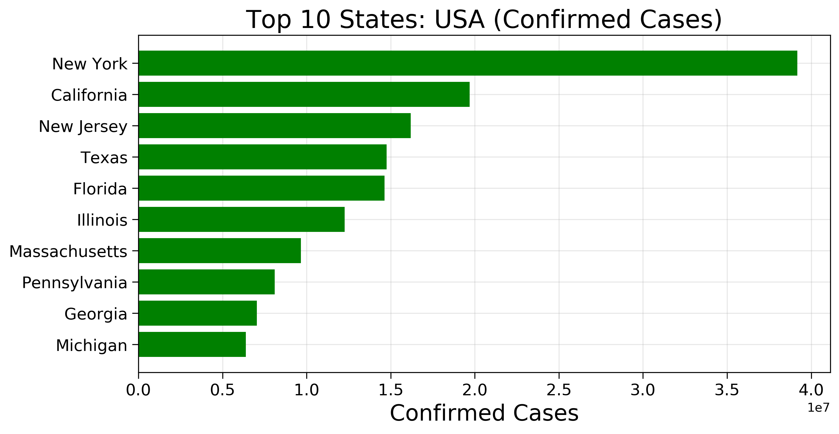
From the graph Fig(k), we can identify the top states that have the highest confirmed cases, which is more easier to find than a table containing numbers or a spreadsheet.
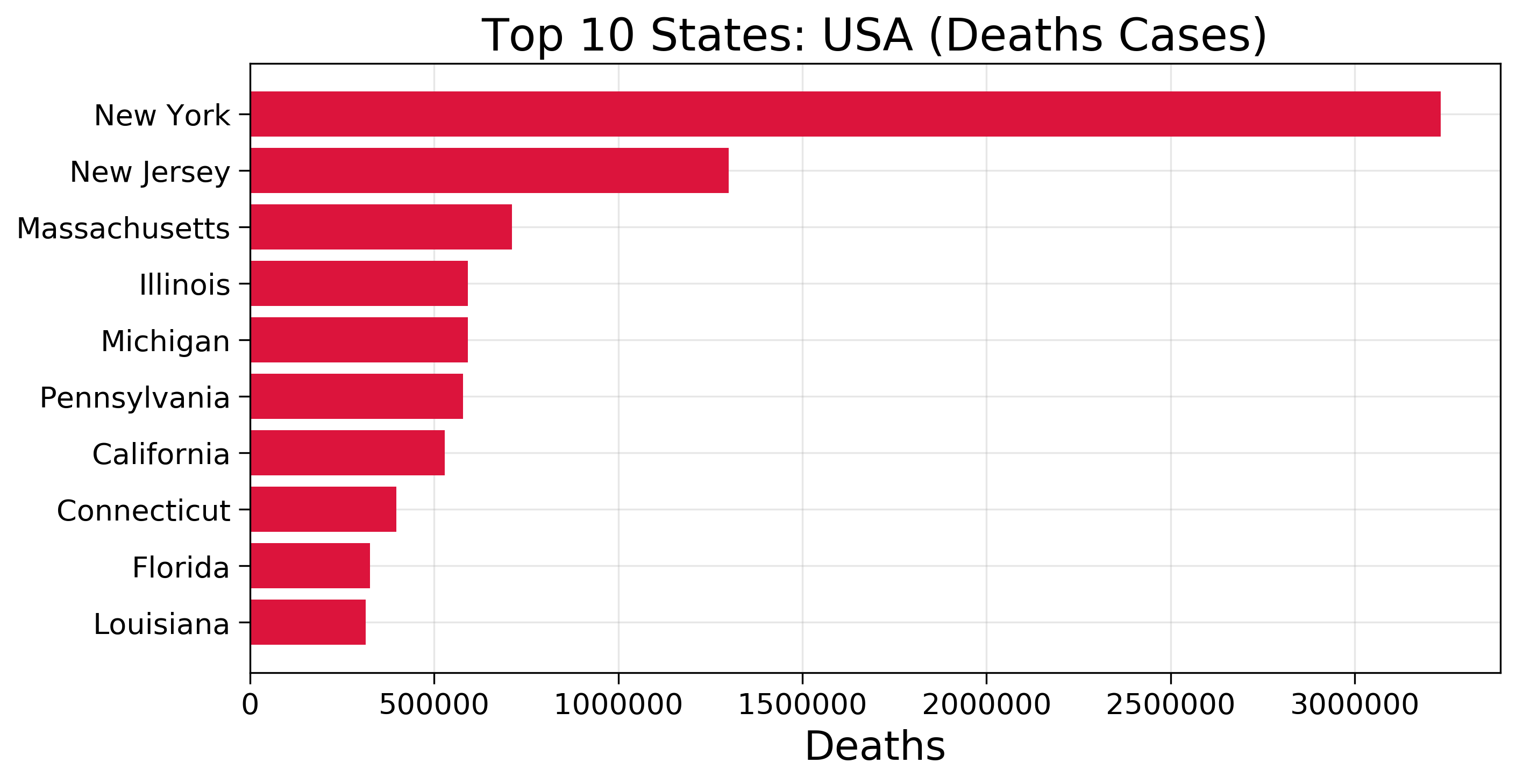
f = plt.figure(figsize=(10,5),dpi =300)f.add_subplot(111)# TO plot axes on the graphplt.axes(axisbelow=True)# Plotting the graphplt.barh(usa.groupby(["state"]).sum().sort_values('deaths')["deaths"].index[-10:],usa.groupby(["state"]).sum().sort_values('deaths')["deaths"].values[-10:],color="crimson")# The appearance of ticks, tick labels, and gridlinesplt.tick_params(size=5,labelsize = 13)# x labelplt.xlabel("Deaths",fontsize=18)# Title of the graphplt.title("Top 10 States: USA (Deaths Cases)",fontsize=20)# Grid layout for the plotplt.grid(alpha=0.3)

These are a few examples I wanted to explain to understand why data visualization is so important in data analysis.
Thank you for reading and I hope that you found something useful here to apply on your own data. If you did, feel free to like this post!
As always, if you have any questions or comments feel free to leave your feedback below or you can always reach out to me on LinkedIn. Till then, see you in the next post! 😄
python
data analysis
data visualization
guide