
Daisy UI 3.0 Released: New components, themes, improvements, and more!
2 June, 2023
9
9
1
Contributors

Daisy UI, a popular free and open-source Tailwind CSS component library, has just released version 3.0. This major update includes several new features, improvements, and bug fixes.
New loading component
Daisy UI has introduced loading spinners with its latest version.
Spinners indicate an activity or event is currently running in the background, and the UI will be changed very soon. You can use spinners while fetching data from APIs, loading states, rendering complex animations or visualizations, and for anything that takes more time to render on UI.
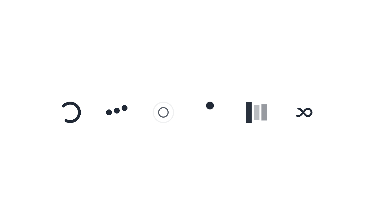
There are seven types of spinners available. All of them are available in four sizes and several colors.
Here are the types of spinner classes available:
loading: default class to addloading-spinner: spinner animationloading-dots: dots animationloading-ring: ring animationloading-ball: ball animationloading-bars: bars animationloading-infinity: infinity animation.
For spinner sizes, you can use any of the four classes:
loading-xs: Extra small spinner sizeloading-sm: Small sized spinnerloading-md: Medium sized spinnerloading-lg: Large size spinner
You can change the color of the spinner by prefixing the color property with text-* class.
Here is an example of how you would create a small loading spinner with a primary color in JSX:
<span className="loading loading-spinner loading-sm text-primary"></span>New component: Accordion
Accordion shows or hides the content from a list of multiple items, but only one item can stay open at a time. This is useful while displaying multiple related options that have more data to display with them. You can stack main titles on top of each other, and the associated data will be displayed only when the user clicks/touches individual titles.
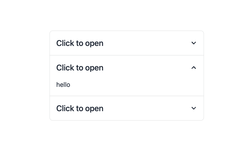
The new Accordion component in Daisy UI is an update on collapse but uses radio buttons inside the hood. This makes it possible to make JS-free components more efficient, faster, and accessible. Accordions are used to display FAQs, know more, and similar sections.
Daisy UI provides three component classes and four modifier classes to make an accordion.
collapse: An important class that defines an Accordion component.collapse-title: Nested withincollapse, it acts as a title of the Accordion.collapse-content: Nested withincollapseand sibling tocollapse-title, it displays content for the individual titles.
The four modifiers are of two types: icons and the current state of an accordion.
collapse-arrow: Adds an arrow icon that represents the state of the Accordion.collapse-plus: Adds a plus or minus sign based on Accordion's statecollapse-open: Used to force open the Accordioncollapse-close: Used to force close the Accordion
For example, if you need to create a grouped accordion with two titles with an arrow icon in JSX, here's how you would do it:
<div class="join join-vertical w-full">
  <div class="collapse collapse-arrow join-item border border-base-300">
    <input type="radio" name="my-accordion-4" checked="checked" />
    <div class="collapse-title text-xl font-medium">
      Click to open this one and close the others
    </div>
    <div class="collapse-content">
      <p>hello</p>
    </div>
  </div>

  <div class="collapse collapse-arrow join-item border border-base-300">
    <input type="radio" name="my-accordion-4" />
    <div class="collapse-title text-xl font-medium">
      Click to open this one and close the others
    </div>
    <div class="collapse-content">
      <p>hello</p>
    </div>
  </div>
</div>
New component: join
The new component introduced in Daisy UI 3.0 replaces button-group and input-group. It now uses a more generic name for ease of understanding.
Join is a container for grouping multiple items; it can be used to group buttons, inputs, or any other element. Join can be used to create a horizontal or vertical list of items. Join applies border-radius to the first and last item.
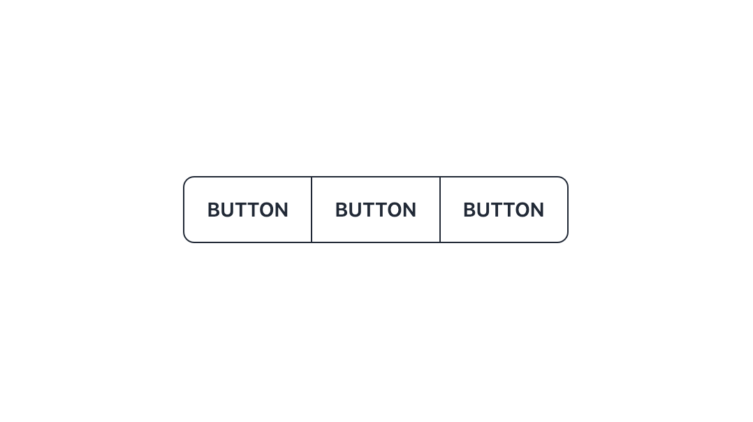
It groups items vertically or horizontally. It also gives a border-radius to the first and last item based on responsive direction. However, if your item has a border, it overlaps the border between items, so it looks good automatically.
The join component has four classes, two to define components and two to define responsiveness.
join: Creates a container for multiple items.join-item: Creates individual items inside ajoinclass.join-vertical: Shows items specified injoin-itemin vertical orientationjoin-horizontal: Shows items specified injoin-itemin horizontal orientation. It's the default selection
This is how to create a vertical button container group in JSX:
<div class="join join-vertical lg:join-horizontal">
  <button class="btn join-item">Button</button>
  <button class="btn join-item">Button</button>
  <button class="btn join-item">Button</button>
</div>
New themes
There are several improvements in themes as well.
Firstly, only two themes are active by default: light and dark.YOu can enable them by adding theme: true in the configuration file. Similarly, you can list the names of the themes you want to enable in the same file.
Secondly, the default dark theme is darker and looks more comfortable and elegant than before.
Lastly, some themes had color improvements and were more accessible when combined with different elements. Of course, you can still customize the colors as you wish or even add your own themes. But here's the default set of improved themes: light, dark, bumblebee, forest, garden, Halloween, luxury, retro, synthwave.
New component features
drawerno longer disables the root element scroll. Now it naturally lets the root element scroll. Also, it is hidden by default.modalnow supports the new native HTML element <dialog> as well.tooltipnow gets visible with keyboard navigation as well. Also, it's responsive now.- New
btn-neutralmodifier class for the button. Thebinclass usesbg-base-200by default instead ofneutral. Also, it has a less bouncy click animation effect.
Breaking changes
Some changes break the functionality of Daisy UI classes if you are migrating from older versions.
- The latest version doesn't have a
drawer mobileclass. - Removed an extra wrapper of the
<div>element fromalert. tablehas a width of 100% by default. Also, it doesn't haveactive,table-compact, orhovermodifier classes anymore.dropdowndoesn't have az-indexby-default now.
Better Developer Experience
The newest Daisy UI version brings more internal changes that will help developers code efficiently.
- The
/src/colorsdirectory is renamed to/src/themingas it does more than colors and the previous name was confusing. - Removed extra dev dependencies.
- Console logs are more informative. They warn you about possible config issues and how to fix them.
- The daisy repo is now smaller in size and takes less disk space. Also, the new document website is running on the latest version of SvelteKit and Vite.
Frequently Asked Question
What is Daisy UI?
Daisy UI is an open-source Tailwind CSS component library that provides you with several UI components built on top of Tailwind CSS. You can use these components with HTML5 or JSX.
What are the benefits of using Daisy UI over Tailwind CSS?
Daisy UI enables you to design components with fewer class names than plain Tailwind CSS. This leads to faster development and smaller bundle size. Also, it makes your HTML/JSX files easy to read and understand.
Is knowing Tailwind CSS essential to use Daisy UI?
You can use Daisy UI even if you are not fully aware of Tailwind CSS. However, ensure that you are aware of the basics of Tailwind CSS, like its configuration file.
Wrapping up
Daisy UI 3.0 has been released with a number of new features, improvements, and bug fixes. These include unlimited themes, new components, improved performance, improved documentation, improved accessibility, and bug fixes.
tailwind
component
daisyui
daisyui3
cssframework